Professional services of Streaming for audio and video
Copyright 2022 © FLUMOTION SERVICIOS S.A.
As a technology company we are always looking to be up to date, and that is why we have made a change in our brand, and in the whole visual identity system, since we no longer felt identified with the previous brand. Our intention is to make this new brand last definitively over time.

The redesign of the brand combines the simplicity of geometric shapes with the creation of a new symbol close to the iconography of the Streaming and video sector.
The typography has also changed, seeking to increase legibility, using geometric and elegant shapes.
The brand’s colors are now four, vibrant and flat, selected to be functional in both light and dark environments.
This change in branding is also reflected on the website.
As a pioneer company in the Streaming sector in Spain, with more than 15 years of experience, we are committed to dynamism and flexibility in this new website.
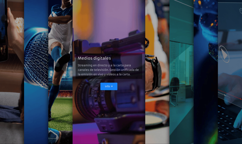
We have made a radical design change by integrating our new brand into it, giving importance to movement, represented in the animation of photographic elements, and treating the content in a more direct way.

Our intention is clear, this new website is an active way of contact between the company and the customers, and we want it to reflect our high work capacity and adaptability to the needs of our customers.
Copyright 2022 © FLUMOTION SERVICIOS S.A.